


On June 5, 2025, Lofree updated its official X and posted a new FLOW 2 teaser image.

Lofree’s design pays homage to the design philosophy of Dieter Rams, according to the company.
 Kawamura
I am a designer who proposed the 10 laws of good design.
I also base my creative activities on this philosophy.
The teaser image is composed of monotone aluminum and black, a composition that seems to showcase the product’s affinity with Mac products.
….
From a maniac’s point of view, we noted that the “shape of the keycap” was disclosed.
Let’s take a closer look.

Further expansion.
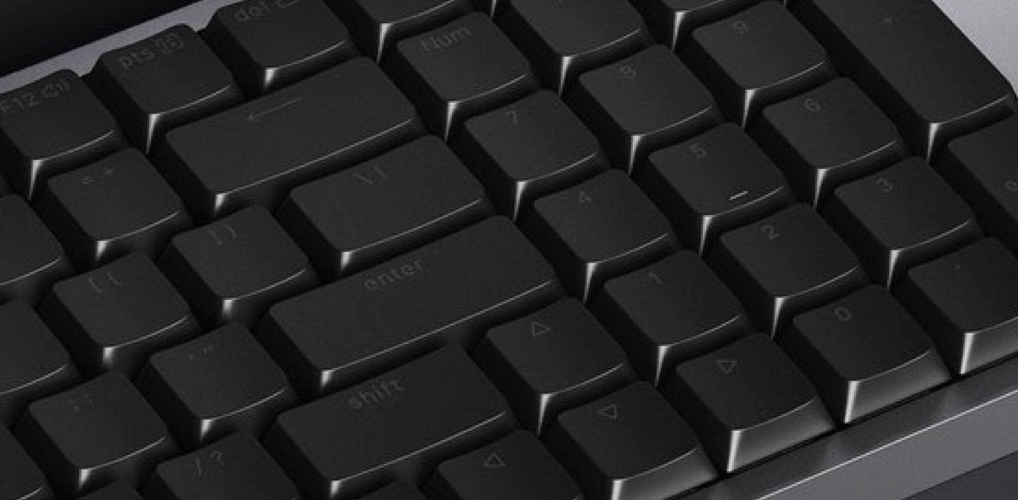
The old (v1) keycap shape was non-step sculptured (flat with no difference in slope from row to row) and spherical (depressed toward the center of the keycap).
However, looking at the v2 shape this time around, we see that the key shape has been changed from a spherical to a cylindrical design, although the non-step sculpting chord is common.
KawamuraCylindrical shape refers to a cylindrical shape with arched keytops, as described in detail in an article I contributed to HHKB Life.

The cylindrical shape is probably the most frequently adopted keyboard shape, such as the Cherry profile.
Although it does not have the same key-center-guiding = sucking sensation as spherical keycaps, we believe that one of the advantages of spherical keycaps is that they naturally guide you to the center of the key, which is comfortable and allows you to type in a fuzzier position than spherical keycaps.
Well…but I can’t get enough of this lumpy feeling.
This time, the line may be thicker with three different lineups: 65%, 75%, and 96%.
I can’t wait for the announcement.


Google検索の「優先ソース」にGreenkeysを追加します
Add Greenkeys as a Preferred Source on Google

