


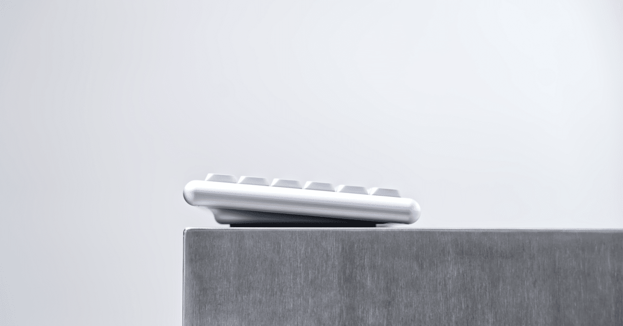
Here is the ultimate in low-profile, curvaceous beauty.
The Vero75 is a 75% layout low-profile mechanical keyboard sold by Chosfox.
Following a Kickstarter crowdfunding campaign in December 2025, stock sales began on the official website.
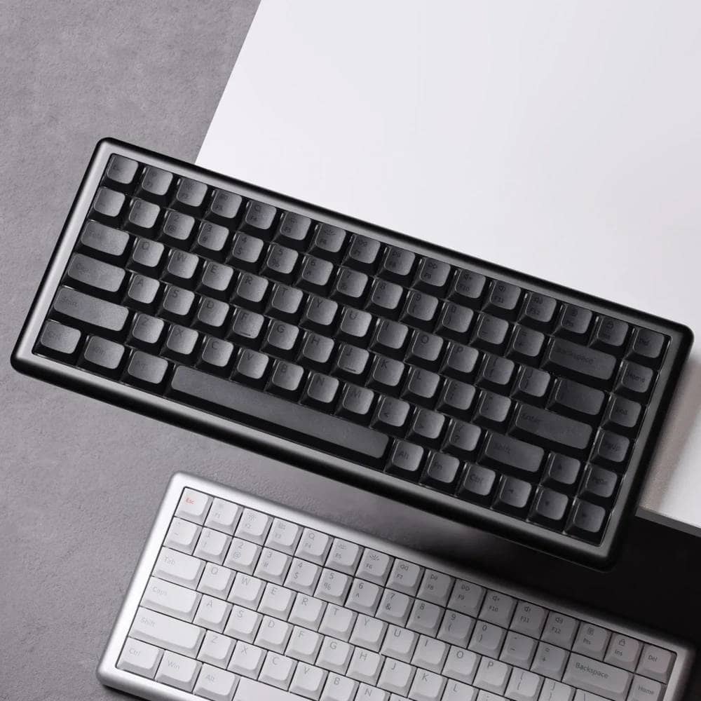
Compared to the initial launch, the color variations have increased to four: Deep Space Gray, Silver, Vintage White, and Pure White. For Deep Space Gray, the keycap design has been updated.
The case was designed by PMD (Masro), a designer from Japan. Greenkeys highly rates this keyboard for its exceptionally high-quality looks and a wonderful typing feel that becomes addictive.
In this content, we will review the VERO75.

- 考え尽くされた上質な打鍵感
- 曲線の美しさがたまらない
- 傾斜付きでステップスカルプチャードでないキーキャップが斬新
- トータルデザインとして完成されている
- 重量があるため持ち運びには不向き
- 技適取得済みだが販売は海外サイトのみ

Chosfox VERO75 Specifications Overview

| Item | (technical) specification |
| Product Name | VERO75 |
|---|---|
| Layout | 75% layout (US alignment / 82 keys) |
| Case Material | 6063 aluminum alloy (fully CNC machined) |
| Surface Treatment | 220 mesh bead blasted finish + anodized aluminum |
| switch plate | PC (with slit) |
| Mounting Method | Gasket mount |
| Size | 327.5mm × 135.8mm |
| thickness | Front: 16mm / Rear: 25mm |
| Typing angle | 5° (fixed) |
| Weight | Approx. 1.0 kg (assembled) |
| access method | 3-mode support (wired USB-C / Bluetooth 5.0 / 2.4GHz wireless) |
| Pauling rate | Wired, 2.4G: 1000Hz / Bluetooth: 125Hz |
| battery | 3600mAh |
| Supported OS | Windows / Mac / Linux |
| firmware | QMK Firmware / VIA Support |
| switch | Kailh Choc V2 (Hot-swappable) |
| keycap | PBT material / Sublimation printing (Dye-Sub) |
| Backlight | RGB (South-facing) |
| Color | Deep Space Gray / Space Silver / Vintage White / Pure White |
Color Variations
There are currently four color variations available.
They are Deep Space Gray, Space Silver, Vintage White, and Pure White.


Vintage White was added on May 30, 2026, and Pure White was added on June 25.
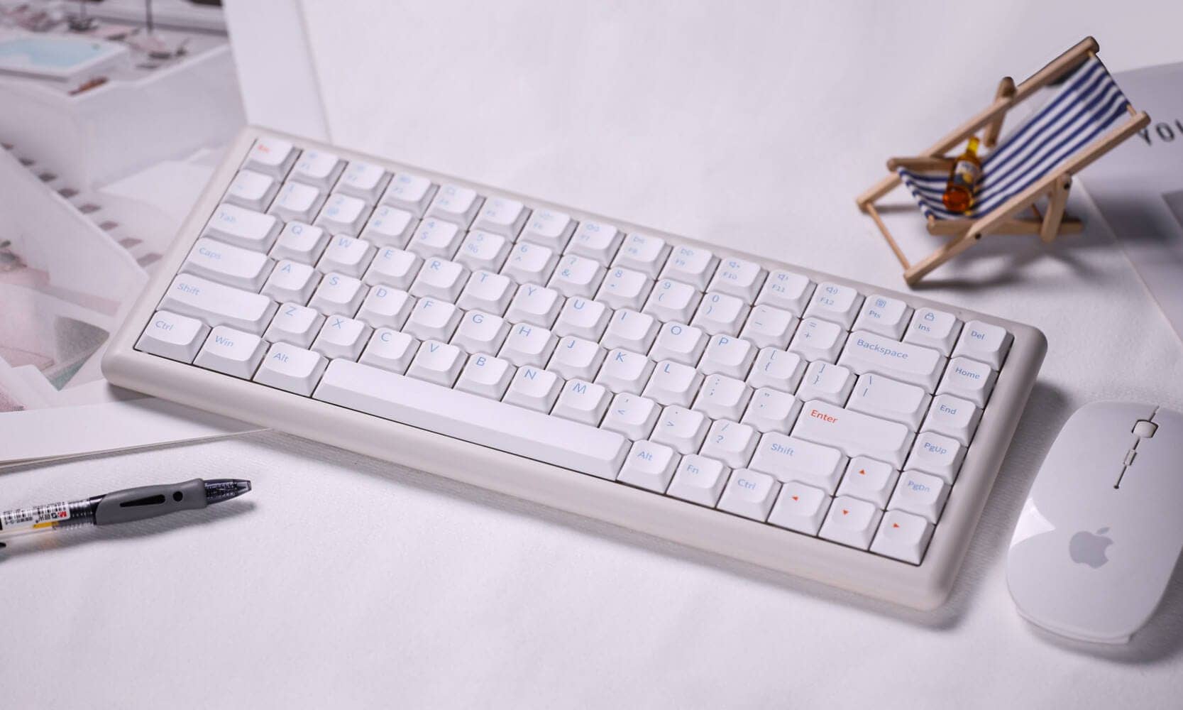

Additionally, the keycap colors included with the Deep Space Gray model have been refreshed.
Adopted key switch

About the Chosfox Vero75 Price

The price of the Vero75 varies depending on the specifications.
The assembly kit without switches and keycaps is $141.00, while the fully assembled version with switches and keycaps is $156.00.
Also, the Pure White model is available for $152.00 as a release commemorative discount.
As options, Foot Pads can be added for $3.00, and a dedicated low-profile keyboard bag for $11.99.
Vero75 Base Price List
| classification | Color | Switches / Kit | Connection type | Price |
|---|---|---|---|---|
| Fully Assembled | Deep Space Gray / Space Silver / Vintage White | WHITE RAIN (Linear) | TRI-MODE / Wired | $156.00 |
| Fully Assembled | Deep Space Gray / Space Silver / Vintage White | BLACK CLOUD (Tactile) | TRI-MODE / Wired | $156.00 |
| Fully Assembled | Deep Space Gray / Space Silver / Vintage White | DEEP SEA SILENT (Linear) | TRI-MODE / Wired | $156.00 |
| Fully Assembled | Deep Space Gray / Space Silver / Vintage White | DEEP SEA SILENT (Tactile) | TRI-MODE / Wired | $156.00 |
| Kit | Deep Space Gray / Space Silver / Vintage White | Only Kit (No switches & Keycaps) | TRI-MODE / Wired | $141.00 |
Option Set Prices
| option | Display Name | Price |
|---|---|---|
| Positioning Plate / Foot Pad | Vero 75 Positioning Plate / Foot Pad | $3.00 |
| Keyboard Bag | Chosfox Low-profile Keyboard Bag | $11.99 |
Review Environment
The review environment is as follows
- Connection environment: macOS
- Switch used: Kailh choc v2 White Rain
- Layout: 75% ANSI layout (English alignment)
- Primary use: content writing (typing Japanese)
キースイッチスペックはこちら▷▷

- Switch compatibility: Choc V2
- Switch type: Linear
- Top housing: POM
- Bottom housing: POM
- Stem: POM
- Total travel: 2.8 ± 0.25 mm
- Operating travel: 1.2 ± 0.30 mm
- Operating force: 50±10gf
- Spring: 15.5mm
- Factory rub: Yes
Information reference: Yousha Kobo
Chosfox VERO75 Review
Let’s take a quick look at VERO75.
It is packaged in a fairly solid, die-stamped presentation box.
Upper and lower two-piece design with the top lid opening upward.
The keyboard color depicted on the box appears to be white, regardless of the body color.

The reverse side has a distinctive tilt-leg drawing.

As for the product specifications, it looks like they are printed on a sticker on the side.


Let’s open the package.
It is snugly packed in urethane foam designed to be exactly the right size and seems unlikely to be damaged in transit.
The white box at the top holds accessories.

Let’s take a look at what’s inside.
Contents include the keyboard itself, user manual, replacement keycaps (printed for Mac), USB dongle for 2.4GHz band, Type A to C cable, and keycap/key switch puller.

Let’s take a look at the appearance of the keyboard.
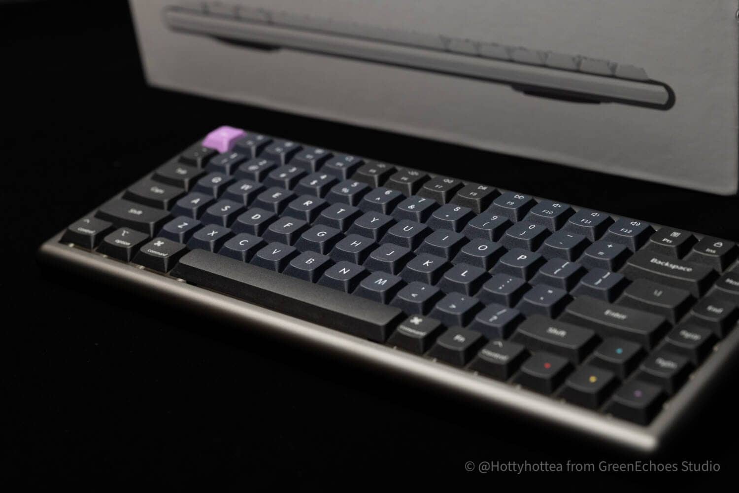
The unit provided for this review is the “Deep Space Gray” color.
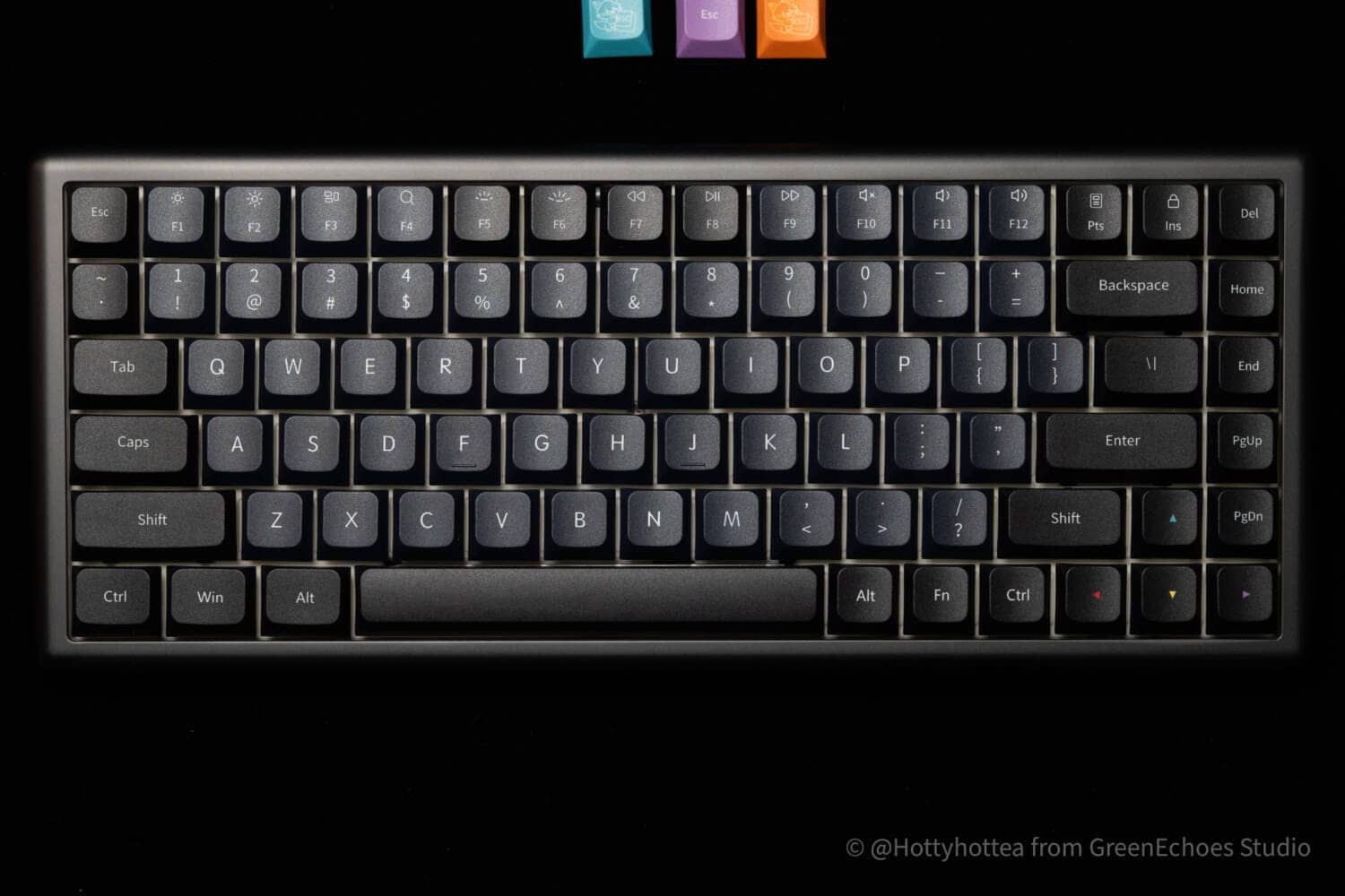
It is available in three other colors: Silver, Vintage White, and Pure White.

The keycap colors have been refreshed, changing to a “Sumi” (ink black) inspired design with black legends on a black base.
The keys are printed by sublimation printing and the keycaps are made of PBT.
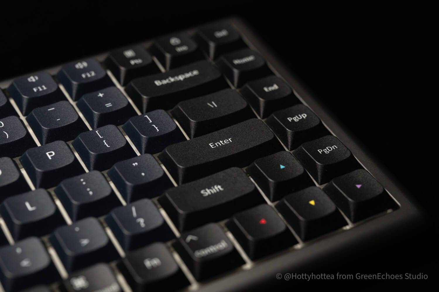
Except for the arrow keys, which are colorfully printed, all other keys are printed in white.


Included keycaps are printed for Mac in addition to the three keycap colors for accent use.

The keycap is center-printed to match the Windows keycap, but the Mac keycap was slightly floated because the legend is located on the lower right.
 Kawamura
Personally, I would have liked to see a unified center legend.
If you want to match the others, you may not need any symbols, only alphabetic characters.

The accent key caps look very good because of the black base throughout.

As for the key profile, the main feature is a low-profile design, with a uniform slope in all rows.
It is a curious approach in that all keys are unified with a Z-row slope (high in the foreground and sloping toward the back), as in the Cherry profile.
KawamuraI could type without any discomfort, although the feeling was that my finger belly might hit it when reaching from the home position to the number line.

Let’s look at the details of the keycap.
Homing key is bar type.
Protrusions are modest, but firmly fingertip-recognizable.
There is no bleeding of sublimation printing, and it can be said to be very clean.
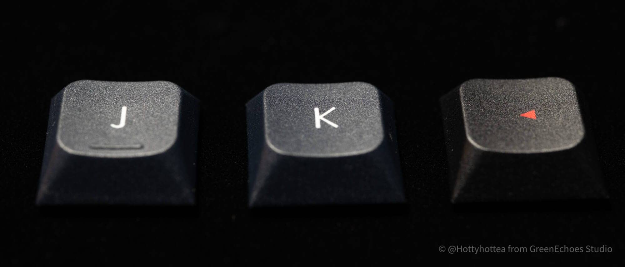
It can be inferred from the back of the keycap that the original keycap color was white.

There are no burrs on the keycap edges, and the molding of the cross stem is highly accurate.

Kailh White Rain keyswitches are used.
The switch plate is probably made of PC material, and the overall slit makes the keystroke feel quite soft.
In addition to the plate effect, the gasket-mounted structure and sound-absorbing materials result in a low, deep keystroke sound.


LEDs under the keyswitches are mounted on all keys and face south.

Then we will look at the sides.
KawamuraThe appeal of this keyboard cannot be seen only from above.
The real attraction is the beauty from the sides to the back.
See.
The beauty of these rounded sides.
Uniform roundness that makes you want to stroke it with your fingers, without feeling any corners.
#220ビードブラストで仕上げられたアルマイト処理された6063アルミニウムはただただ美しい。

From the top to the sides to the bottom, all surfaces are connected by smooth curved surfaces, creating a lump-like shape with no sense of “beginning or end” anywhere.

Except for the Type-C terminal hole on the back, there are no unnecessary decorations at all, and you can just enjoy the beautiful rounded body.
In addition, VERO75 even seems to be calculated to reflect light.
It seems to have been designed so that light flows naturally without interruption and shadows fall softly, and perhaps because of this, one can enjoy the way its expression changes wonderfully depending on how the light hits it.
Moreover, the expression differs between natural and artificial light. (No, really.)
KawamuraI noticed after developing the film that it is “gray”.
I try as much as possible not to change the color of the photo when I take it, but this is a strange one, looking like a champagne gold as well.

Let’s also look at the reverse side.

Due to the constraints of the two-piece construction, the screw holes are visible, but you can see how the sides and back are beautifully connected by a curved line.

The shadows created by the rounded body are so soft that it gives the illusion that something resides in the inorganic object of the keyboard.
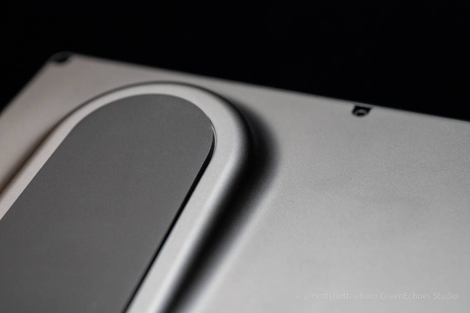
The tilt leg is fixed at 5 degrees, and the beauty with functionality is also a point of appreciation.

And there is a battery built into this leg.
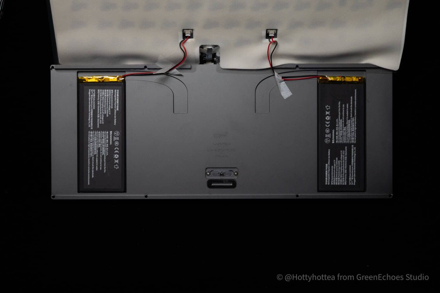 Kawamura
Masro-san, who designed it, is amazing, but the technology to be able to carve this out is also tremendous.

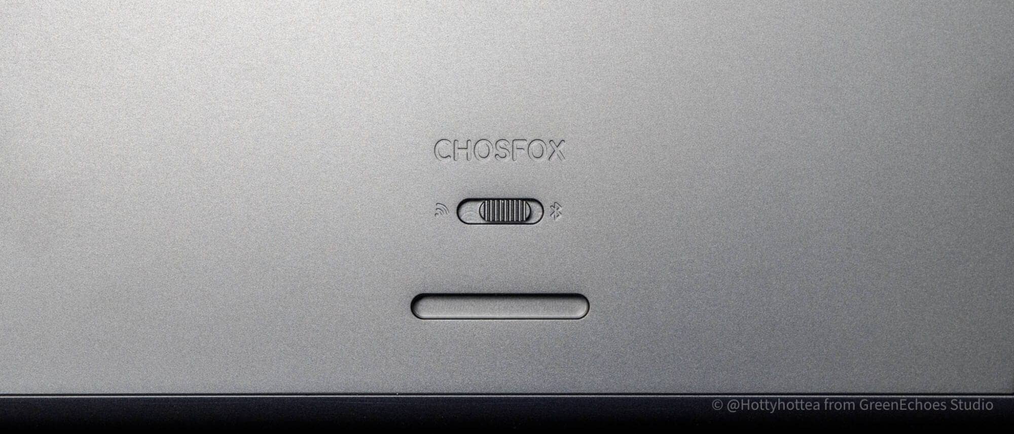
To preserve the beauty of the sides, switches are located on the bottom.
The center is the USB wired connection, the left is the 2.4GHz connection, and the right is the BT connection.
Of course, since it is technically compliant, it can be used with confidence in Japan.
And this keyboard has a ridiculously great feel for typing.
It is quite difficult to verbalize this greatness, but it is like “the high-quality tactile feedback you feel after pressing a keyswitch all the way down is pleasant.
The secret probably lies in the structure of the keyboard.
So let’s disassemble it.
The interior can be accessed by removing six M2-size hexagon socket screws.

I apologize for the lack of clarity, but there is a daughterboarded Type-C terminal on the top frame to which a flexible flat cable is connected.
Removing this allows access to the interior.
(It may be a little more difficult to remove)
 Kawamura
I was super excited to see “PMD” firmly engraved on an invisible part of the bottom case!

And perhaps the secret of the keystroke feel is this.
The flex-cut PC plate is constructed to float in mid-air with a gasket to create a soft keystroke feel, and two layers of sound-absorbing sheets are placed between the switch plate and the board and underneath to create a dead, low keystroke sound.


I was amazed at how they were able to incorporate so much precision into such a thin product.
This is truly a technologically advanced keyboard.


Evaluation of keystroke feel and keystroke sound
- Loudness of keystrokes: ★☆☆☆☆☆ ( Not that loud. (Not that loud, but usable in an office environment depending on the environment)
- Sound level: Low
- Key weight: Slightly heavy (50gf is the impression of many who find it slightly heavy)
- Bottoming feeling: fluffy (gasket mount, slit POM plate, and sound absorbing material do a good job)
- Key wobble: normal
Chosfox VERO75 Attraction

The following is a summary of the appeal of VERO75.
- Well-thought-out, high-quality keystroke feel
- The beauty of the curves is irresistible.
- Novel sloped, non-step-sculptured keycap.
- Completed as a total design.
- Technical Conformity (Giteki) Certified

Points to Note Before Purchasing the Vero75
The following are some points to consider before purchasing the Vero75.
- No Japanese-language lineup
- The silver body is prone to scratches
- The outer box may be damaged during international shipping
- The default switch plate is PC material; FR4 and others are optional
First, the Vero75 does not have a Japanese (JIS) layout.
Therefore, it may be a bit niche for some Japanese users.
Another point of concern is that since it is shipped internationally, damage to the outer box during transport may be unavoidable.
This is something that needs to be understood regarding air freight.
KawamuraIn fact, overseas, the general consensus is often that “cardboard and outer packaging are strictly for protection,” and as long as the contents are safe, it is considered acceptable.
This can differ significantly from Japanese sensibilities, so it requires understanding.
Also, while the default plate is made of polycarbonate, if you wish to change it, you will need to purchase an optional plate separately.
If you prefer a slightly firmer typing feel, consider purchasing a carbon fiber or FR4 plate.
Price, sales format, and availability
- Availability: ★★★☆☆ (Available for purchase from the official international website)
- Cospa: ★★★★★ (incredibly high quality low price)
- Form of sales: Normal sales
- Where to Buy: Official Website
Summary
This is a review of the Chosfox VERO75.
The VERO75 is a keyboard with great appeal not only from the standpoint of its great key feel, but also from an aesthetic standpoint.
Until now, PMD design has been mainly “straight lines” and the beauty of complex structures.
However, when it comes to this VERO75, we get a glimpse of a different side of him.
If you are interested, please also check the official website.
- First written on: 12/16/2025
- Last Updated: 2026/6/26
- Method of coverage: Product offer
- References & Image Credits: https://chosfox.com/products/vero75-low-profile-qmk-via-mechanical-keyboard
- Conflict of Interest: Product provided: Yes | Affiliate links: Yes


Google検索の「優先ソース」にGreenkeysを追加します
Add Greenkeys as a Preferred Source on Google

